

Everywhere I turn I see gray. Or, should I be chic for once and say gris or greige or griege? I actually never knew you could spell greige – griege, both ways are correct. But, let’s get back to just plain gray. It’s everywhere. I know it is in my house. A few months ago, I painted my yellow walls gray. Couldn’t do it fast enough. Every time I show something gray on the blog, I get tons of emails wanting to know the paint color. I can’t tell you how times I’ve been asked exactly what GRAY did Sally Wheat use in her kitchen (Benjamin Moore Fieldstone.) Has everyone gone nuts over gray? A lot of bloggers it seems are currently going gray: Visual Vamp, Velvet and Linen, and Trouvais, to name four, including moi. I even wrote a blog story on a shop filled with gray Swedish antiques called The Gray Door. If you are planning to repaint your house gray, be forewarned! Painting gray is serious business. I went through 15, yes, 15 gray paint samples before I settled on one. Gray paint can suddenly go either purple, lilac, blue, yellow, taupe or just plain Lady Blah Blah before it even dries. Carefully choose your gray and always, always, test it before you go out and buy 50 gallons of one color. Whether you are on the band wagon or not, gray is everywhere these days. Check out these two blogs that write exclusively about the color: Greige (or griege) HERE and The Perfect Gray HERE.
Now, I am perfectly aware that gray was declared the new black last year, and Pantone declared turquoise as THE color of 2010, so I was somewhat surprised at this month’s Elle Decor magazine. While reading it last week, I had to stop – every single ad was GRAY!!! I swear! You don’t believe me? Well, almost every ad was gray, as you will see below.

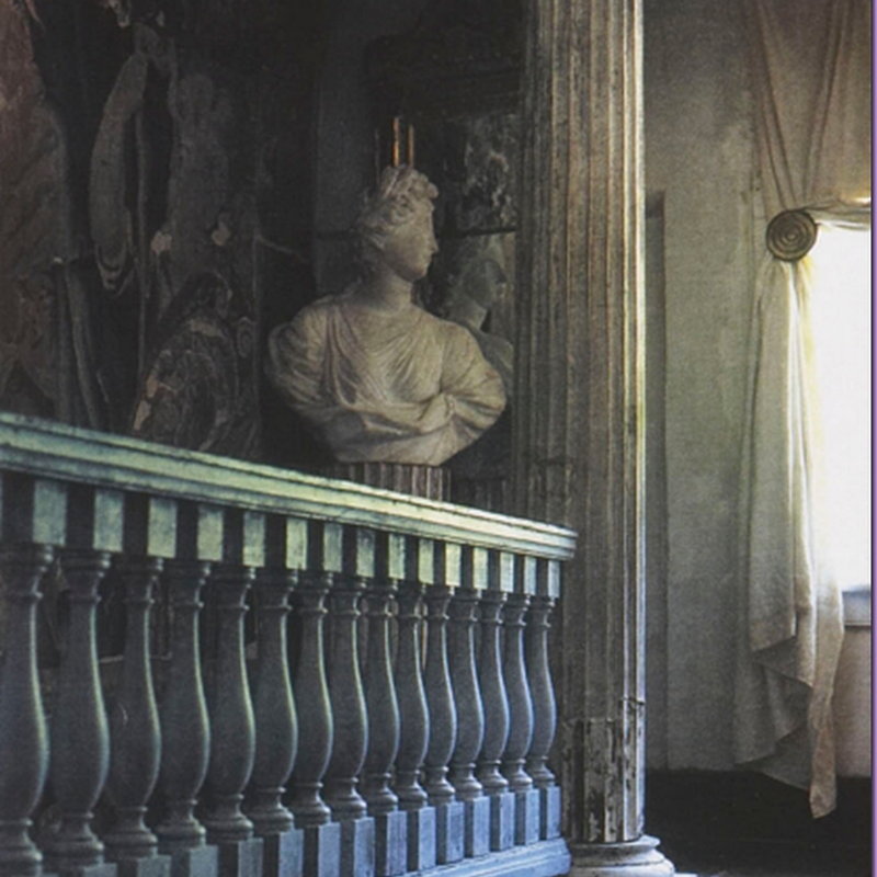
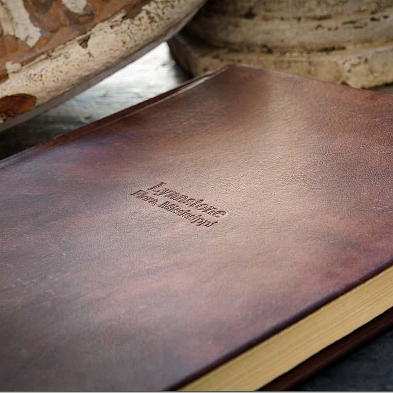
This is the gray I love. Rustic, worn, antique – not the contemporary dark bluish gray.

This light gray with a hint of lilac is so pretty mixed with Swedish antiques. This beauty comes from Splendid Willow’s house!!! Gorgeous.

Gray with a hint of yellow in it. Light gray mixed with darker gray.
 Beautiful cool grays and blue mixed together – Cabbages and Roses.
![[image123.png]](http://lh3.ggpht.com/_t8-Y4w1UKrc/SpRiIDHiXlI/AAAAAAAAjpo/JVY9m9jDDT4/s1600/image123.png)
Chilly, cold gray. Gray that makes you want to grab a sweater and light a fire and warm it up with gilt mirrors. And then move to Belgium.
 Gerrie Bremermann bragged to Southern Accents that she always uses the same palette of creams, whites, ivories. Well, here she went with gray.
 I’ve always loved this dining room by Barbara Westbrook. It’s painted Tobacco by Pratt and Lambert, yet it looks gray to me!
From Belgian Pearls, gah! Too gorgeous for words. Gray paneled walls, crystal chandelier, French doors, the ceiling, the vanishing threshold (thanks to Tara Dillard) !!!!!


Belgian gray mixed with taupe and cream linens.
 I always thought Sally Wheat lived in a gray house. We ALL know her kitchen is gray, but last Friday she repainted her house a Farrow and Ball gray that went blue. Her husband walked in and said “Are the walls blue?” No, but your black eye will be blue in about five minutes!!! Here are her walls before she painted then – the shutters are definitely gray.

In Houston my favorites decor stores are gray - like Indulge, filled with furniture from France’s Blanc d’Ivoire (she just got in a whole new shipment of their gorgeous gray furniture BTW.)


At M. Naeve, even the floors are painted white and gray checkerboard.
 Last year Tami Owen did a beautiful showhouse in West University filled with grays and whites, like the Master Bedroom.

My own paint dilemma started after I put down white marble in my kitchen. The yellow walls had to go, ASAP. It looked terrible with the new marble.

The Pratt And Lambert Feathered Gray looks so much better in my house. It’s a very light gray, bordering on the taupish side. Not for someone who wants a deep, bluish gray.

The dining room shown here in yellow.
 I like it so much better in gray, but the yellow drapes and table cloth will probably be changed out soon.

The Visual Vamp’s dining room was bright red and peacock blue. She really went crazy with gray paint.

The same dining room today – all in grays and whites! I love this change.
Brooke Giannetti from Velvet and Linen has been updating her house. Here, her sunroom is all Shabby Chic in pinks and greens, before.
Now: it is her gorgeous study in Swedish grays. Beautiful!!!!
Recently, Brooke and her husband took their children’s all white study here……
And went all industrial grays. What a great space for their 3 teenagers!!!

Trish from the blog Trouvais has gone just a little crazy painting her room gray. Here are some of her choices. In the end, I think she mixed the feathered gray (my gray) with a Benjamin Moore white. But who knows what she ended up with? She’s probably in some asylum, straight jacketed to keep her away from gray paint and brushes!!!!

A peek at the project – the gray is light and subtle, but so pretty!!!

BEFORE: The Yellow House HERE: This picture cracks me up! Boy, can I relate!

AFTER: She ended up with Coventry Gray by Benjamin Moore, which she said “went a little blue.” Ah, yes. I know that problem. But I think the paint job looks wonderful!

xJavierx showed these popular designer gray colors on his Flickr tour. HERE.
The September issue of Elle Decor was FILLED with ads featuring gray. I was just dumbfounded. Ad after ad after ad was gray. Gray must really be the hottest color out there. But wasn’t the color of the year supposed to be raspberry or mauve? That’s what everyone who went to the European decor shows said – mauve was everywhere. And those who have attended decor shows in the U.S. say purple is THE color. But, didn’t Pantone declare that turquoise was THE color of 2010. This shade exactly:

So, I ask you, if Turquoise is the color of 2010, why are all the advertisers pushing gray so heavily? Here are all the ads in this month’s Elle Decor featuring gray. Let me tell you – most of the ads in the magazines are here, few did not feature gray.
 Kravet went with a big spread on golds and grays from Thom Filicia.
 Plantation went with gray sofa, blue-gray walls and even the zebra rug is gray.
 Baker used a very light silvery gray on their sofas and walls mixed with the golds again.
 Even the rugs are all gray.
Ugh. Yards and yards of contemporary gray, my least favorite. This is SO not me!!!
 For their leathers, Larsen brought in a gray and brown pillow. It could have been any color, but they went with this.
 Arhaus chose gray and cream stripes and grayish taupish upholstery. Love this!!!!
 Macy’s got hip with contemporary gray bedding and walls.
 Even LEVELOR blinds got into the act!!!! Looks like my old yellow walls.
 Travers dark grays with yellow. Sally Wheat keeps telling me she loves that combination and maybe she has a point!?!! Love this ad!
 Bernhardt mixed grays, light and dark with two blue chairs. Pretty.
 Seriously, what is going here? Have you ever seen so many ads featuring gray????
 Gray walls, white bedding, brown wood.
 OK OK OK, I get the point already! Gray is hot!
 Seriously, did American Leather HAVE to feature gray? Why not the color of the year, turquoise?
 The final ad features my favorite gray – Swedish gray furniture, soft grayish taupe on the wood work, grayish white painted floors.
With all this gray in the advertising, you would think the September Elle Decor featured houses with a lot of gray, but no. Not a one. Which was a huge relief after the sea of gray ads. I can’t remember another color that has so dominated like this. Can you? Gray is the new black again, I guess. Personally, I like to wear turquoise, not decorate with it!

AND – IN OTHER NEWS, Beadboard Upcountry in Brenham, Texas is having a trunk show featuring their wonderful line of winter capes and gloves, shown above. The show runs through this Wednesday – so HURRY!!!! Go HERE to get all the details. I have one of these capes myself, and it is truly beautiful!
Post Title
→Gray is the New Turquoise?
Post URL
→http://porobligacin.blogspot.com/2010/08/gray-is-new-turquoise.html
Visit PoR oBliGaCióN for Daily Updated Wedding Dresses Collection


