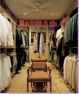
Imagine the man who owns this closet - could there be anyone neater? Just admire how he hangs all the white shirts on the left - nary a print to mess up the order. On the right, the light colored jackets are hung on the bottom rung, the darker jackets are on top. And style? Admire all those orange Hermes boxes, stacked neatly on the back shelf. Yes, indeed, the man who owns this closet has great style. On the top left shelf, Louis Vitton luggage is stored - something tells me its the real thing, no faux LV for this man. Don't miss the mannequin in the center, with ties around its neck. There's even a ceiling fan for those hot Houston days. What a closet! This space says this man has taste and style - oozing out from every pore. The owner? J. Randall Powers, or Randy, as his friends and clients call him. Debonair and handsome, interior decorator Powers is poised on the brink of superstardom, and Houston gets to claim him as a favorite son.
He's young. He's been in the business for less than two decades. There's nothing he can't tackle - there's no style he can't do, and he does it all extremely well. Whether it's transitional, or ultra contemporary, eclectic or traditional, classic or chic - he does it all with style and aplomb. The darling of the society set, his wit and personality make him fun to be with and work with. His clients come back for more. He's been published a zillion times - including a cover of Elle Decor, the equivalent of an Oscar in the design business. Powers is without a doubt the hottest designer in Houston, bar none. Everyone wants to hire him, and half of Houston already has. Fabulously successful, his star is bright, so bright it might blind you - but that would be sad, for how would you enjoy his wonderful portfolio? So, here, for your pleasure, is just a small sample of his work. Powers recently launched his web site - be sure to visit it here and enjoy!
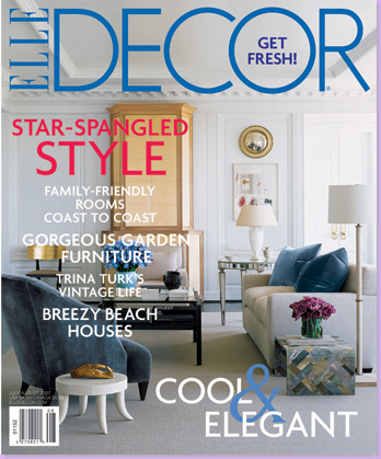
The Oscar: the cover of Elle Decor, 2007. This magazine featured Power's work again this year. Other publications he's been in are Southern Accents, House Beautiful, and Paper City - to name a few.
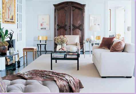
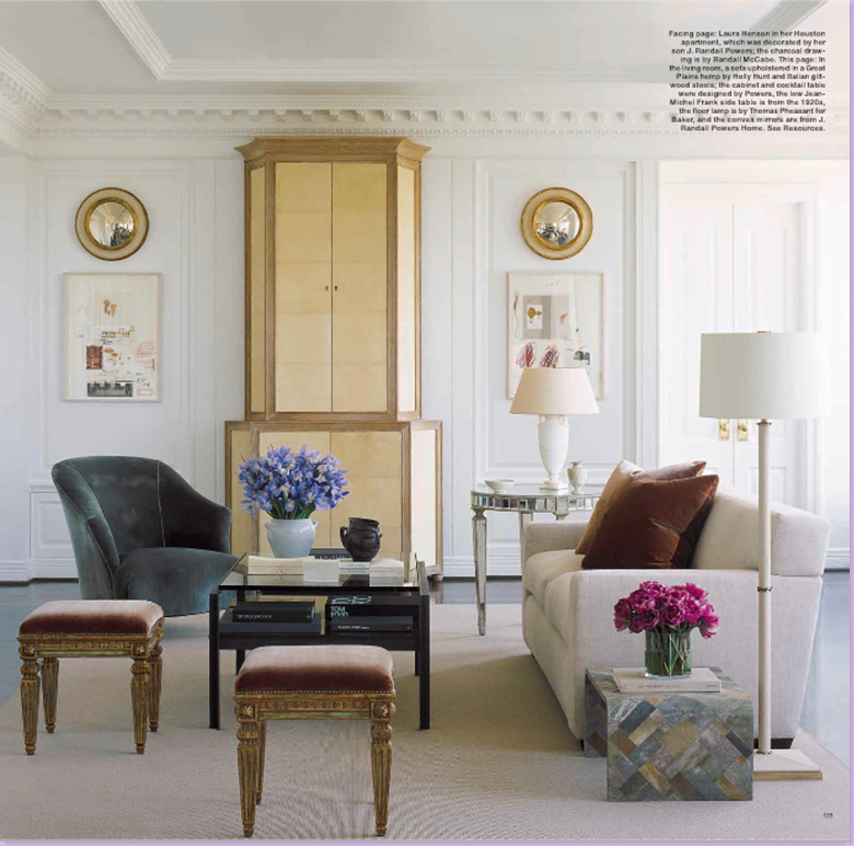
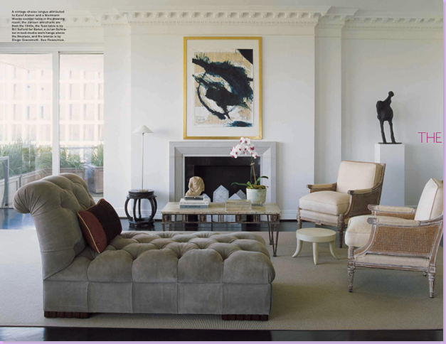
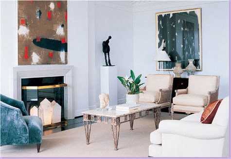
House #1: This high rise apartment featured in Elle Decor is the same room as shown on the cover - styled differently. Elle Decor is notorious for staging their covers. Which look do you prefer? The cover or the space shown here?
Another version of the room. I prefer it this way, but with the blue pillows! The stunningly gorgeous cabinet and the coffee table were both designed by Powers. Note the mix of furniture style: the antique stools with the more modern tables. Powers' success lies in his restraint. His interiors are never cluttered. Each piece is placed with careful deliberation.
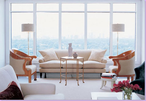
Another living space in the high rise apartment. Again, a mix of old and new - no set style - just a collection of beautiful pieces.
The same room in the high rise apartment, styled differently. Art work is a passion for Powers and is always an important element in his designs.
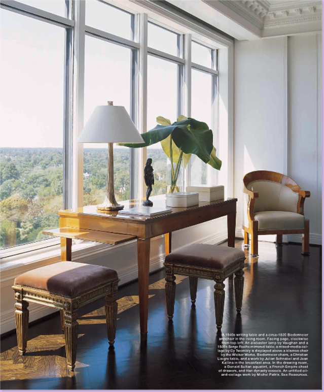
A seating area in front of the windows - notice the gorgeous Biedermeier chairs. .
Again, antiques mixed with mid century modern in a soothing vignette. Powers' strength lies in his ability to pair desperate styles in wonderful combinations.
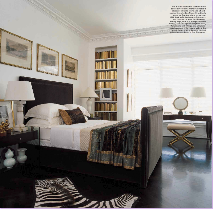
The master bedroom - simple, yet elegant, as each space in this high rise is.
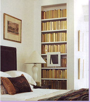
A close up of the bookcase in the master bedroom. The books are placed with the spines facing inside - leaving the gold leaf of the pages to glisten. This treatment caused so much interest with letters to the editors - that Elle Decor featured Powers' bookshelves in a later issue.
Here, in a different home, Powers again used the same technique for books. It is a great tool to unify and soften the loud colors created by books.
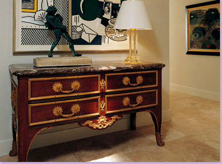
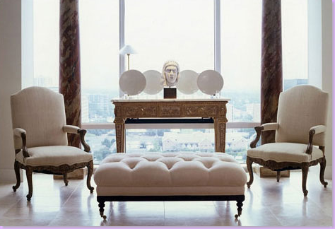
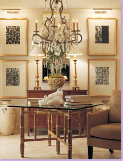
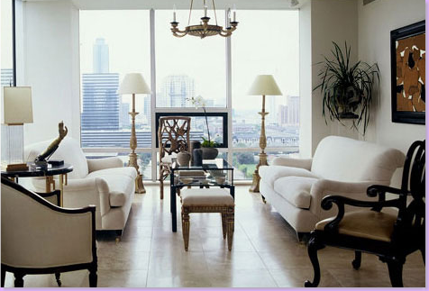
House #2: The entry to a high rise apartment once owned by Powers - he has since moved on. Here is classic Powers at work: a fabulous antique chest with exuberant hardware juxtaposed with pop art. The contemporary lamp balances out the bronze. Powers has amassed an important collection of art as his interest in the subject has grown.
A vignette in Powers' former high rise apartment. All fabrics are white which lets the furniture frames take center stage.
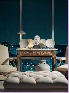
The same view at night, overlooking the city of Houston.
The dining room resembles more of an art gallery than a place to entertain with dinner parties. This is a wonderful way to treat a dining room in today's age when most dinner parties take place at restaurants.
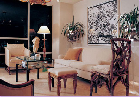
Another space in Powers' former high rise apartment. The unique root chair is accented against the sleeker elements in the space.
The same space, styled differently.
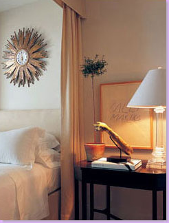
The master bedroom - again, all white and creams. A large sunburst clock is the focal point above the bed.
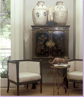
Powers, as many interior decorators do, has moved quite a few times. Follow these two antique chairs on their journey from house to house. Here they sit before a beautiful chinoiserie chest.
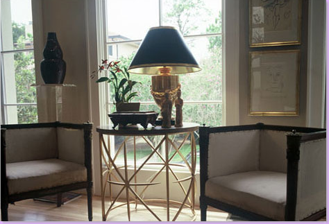
Here, they sit across a brass table.
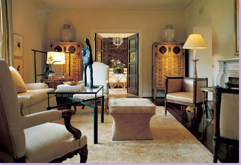
House #3: And here the antique flank a fireplace. This room is fabulous. Notice the two oriental chests with large vessels on top. The floors are are ebony stained - the furniture appears to float above it. This room is heavenly! Perfect job by Powers! The living room is located in an historically important house which was renovated and remodeled by Powers. For his efforts, he was honored with the prestigious Good Brick award by the Greater Houston Preservation Alliance.
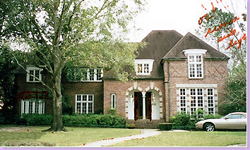
The exterior of the house that Powers renovated. Built in 1929 by Katharine Mott, the house had suffered several unsympathetic additions that Powers sought to rectify and make less conspicuous and more in keeping with the original design. Mott's houses are famous for her lavish use of tapestry brick, asymmetrical facades, casement windows, and designs done on a large scale.
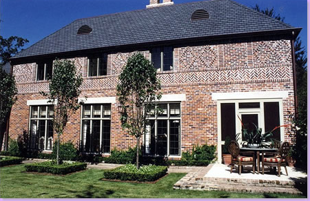
This picture shows the rear of the house with the addition that Powers renovated, adding the intricate brickwork that Mott houses are famous for. Upon completion of the remodeling, Powers and his partner sold the house and moved on to the high rise apartment, which also has since been sold! Typical of many interior designers, is the need to change their environment as their aesthetic is always evolving. Oklahoman Charles Faudree is the winner in that department, though. He's moved over 20 times during his career.
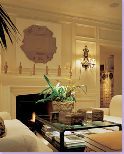
A sitting room next to the living room above. You can just see the oriental cabinet in the doorway.
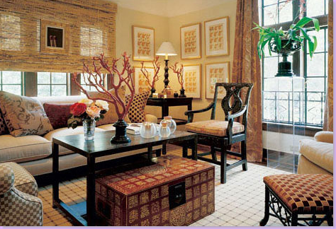
I love this! I believe this room belongs to the Mott house. I adore this - the accent chinoiserie chair is gorgeous. The mix of the shades and curtains, the warmth of the wood against the light upholstery fabrics, the adorable bamboo foot stool and the wonderful oriental box all help make this room warm and inviting. This photo shows the breadth of Powers' talents - his ability to go from stark contemporary to wonderful classic English Manor design.
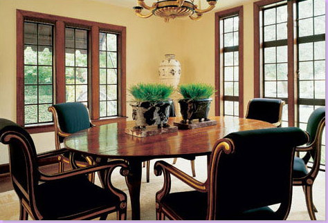
The dining room in the Mott house. Again, English Country style all the way. The light fixture appears to be the same one as used in the high rise apartment. The urn is seen in the high rise too, but the table and chairs are long gone, replaced by the more sleek and sophisticated look that Powers lives with today.
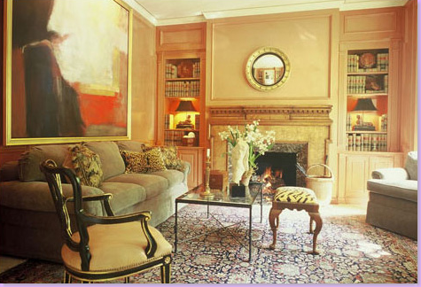
This picture of a library came from Powers' web site. I'm not sure, but I believe this may be from the Mott house! The style matches the English Country Manor look of the rest of the house. I love the lamps in the bookcases. But, the painting is my favorite element in the room.
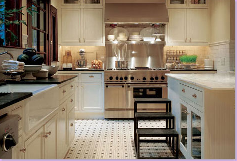
And finally, the kitchen in the Mott house. White carrara marble (which is scarce and impossible to find today!), period tile, farm sink, commercial style range, and white ironstone collection make this an authentic kitchen for a house built in the 20s.
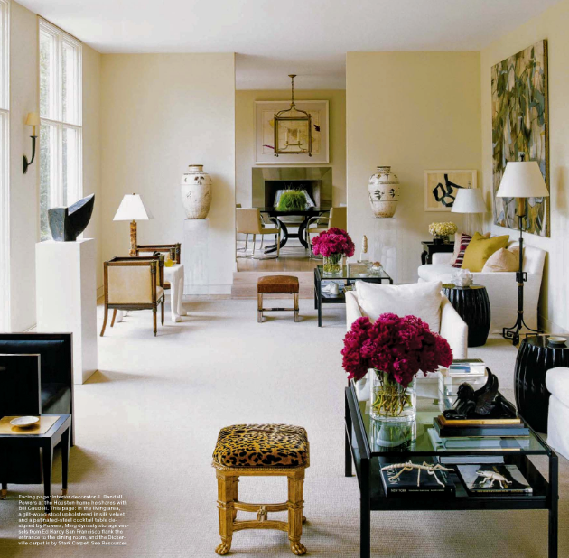
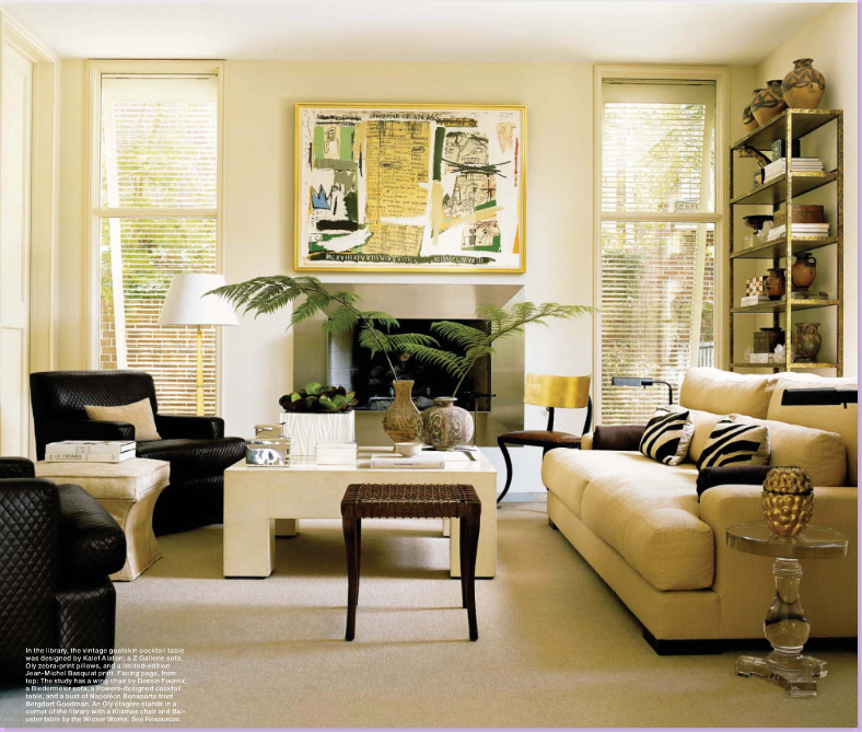
House #4: Featured in Elle Decor magazine this year is this house - Powers' latest home. Powers and his partner lusted after it for years and finally were able to buy it. Here, the living room is shown. Notice the famous two antique chairs on the back left. Powers' own designed coffee tables are used at each seating group. Again, white fabric allows the art work and accessories to take center stage. The dining room is seen through the open doorway.
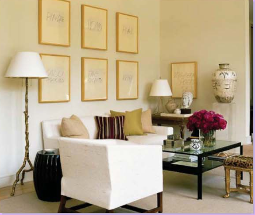
The living room is made up of two seating areas - this is the one on the right. The series of works on paper are by Cy Twombly.
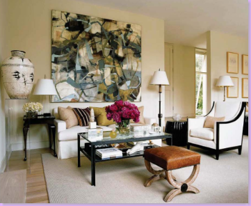
The left side - this painting by Peter Sullivan is phenomenal.
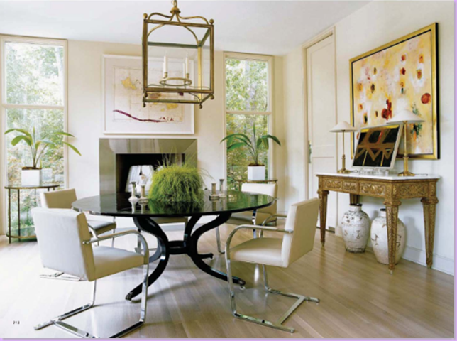
The dining room - j'dore the oversized lantern! The table is Dessin Fournir and the chairs are by Knoll.
The library: the coffee table is vintage Kalef Alaton, a personal favorite of Powers. Notice people: the sofa is Z Gallerie!!!!!! The zebra pillows are Oly Studio. This proves that good style can be affordable and had by anyone with the eye to find out. The painting though, is for the lucky few: Jean-Michel Basquiat.
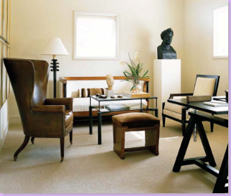
The study's armchair is by Dessin Fournir. A Biedermeier sofa, upholstered in white. Notice the scale - the height of the statue plays off the tall armchair. Interesting, as always!
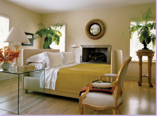
The master bedroom - the bed floats in the room in front of the fireplace.
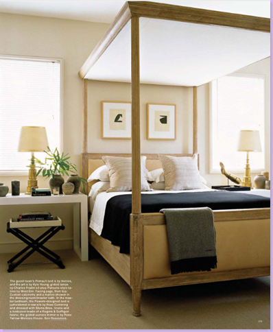
The guest room. The bed is from Ironies. The nightstands are from West Elm! Again, good style has no price.
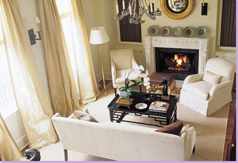
House #5: This home was published in Paper City. Designed for clients who live in an English style townhouse complex - it's a favorite of mine. The living room, all creams with touches of black.
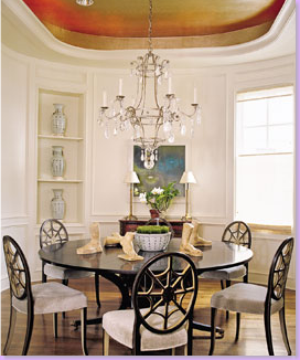
The dining room's square walls were curved by Powers.
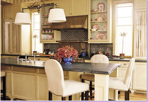
The kitchen, warm and inviting - I love the dark subway tile against the creamy yellow cabinetry. The room is wallpapered in stripes.
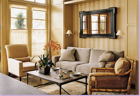
The other side of the kitchen is a sitting room.
I think this is my favorite room Powers' has ever designed! The standout is the lavish use of one print: Colefax and Fowler's Chinese Toile in brown. My favorite wallpaper! This inspired me to use it in my own powder room. I love the touches of chinoiserie in the room. The night tables are English chests.
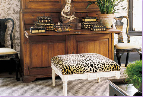
The desk in the bedroom is covered with quill boxes.
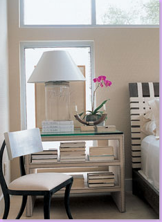
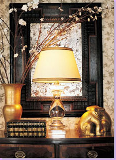
A closeup of one of the night stands.
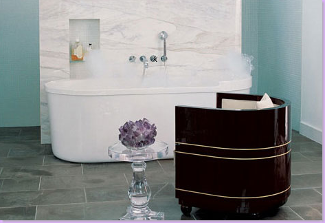
Here is a shot from Powers' web site. A bathroom - does it get any better than this? The chair!!!!!! The marble wall behind the tub. The hidden shower with it's seafoam glass tiles. The acrylic table. Perfection!
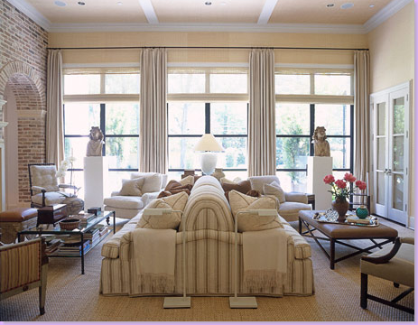
House #6: And finally - this summer House Beautiful featured this home designed by Randy Powers for Andy Singer and his wife, Gayle. Singer is the owner of Visual Comfort, the trade lighting company whose retail outlet is Circa Lighting. The house is the culmination of several years work for Powers and the Singers - which ended in a lasting friendship between them. Powers has designed a line of lighting for Visual Comfort. Though several bloggers featured this house before, no article on Powers could be complete with the inclusion of this wonderful home. A clear departure from the contemporary look so many of Powers' clients want - Randy says that he loved getting the chance to do a traditional design. Here - the family room. A large back to back sofa divides the room into two areas, one for TV watching and one for lingering around the fireplace.
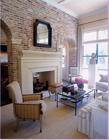
The fireplace side of the living room. The kitchen sits behind the arched brick wall. Seagrass matting covers the floor. Rogers and Goffigon striped fabric.
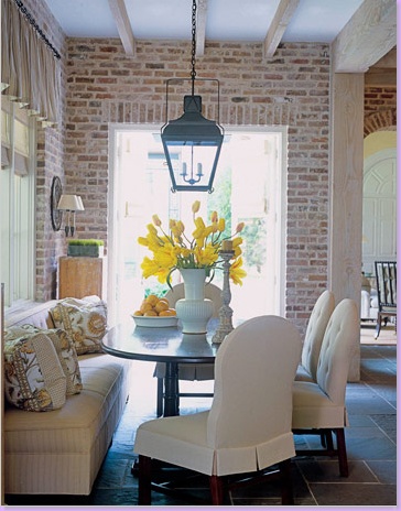
My favorite room in the house - the breakfast area. Bennison fabric on the pillows. Love this room!!
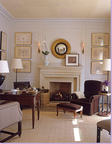
The front study. Again seagrass matting, white walls, and crisp brown fabrics. The Peak Of Chic spotted a visual connection between Bill Blass' style and this room. I see it. And quite a compliment too! The walls of the house are filled with beautifully framed prints.
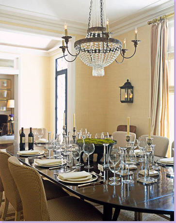
At the front of the house, across from the study, is the dining room. All lighting fixtures are of course from Visual Comfort! Love the lantern sconces.
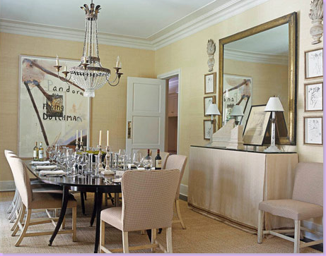
Another view of the dining room. Of course I adore the skirted table buffet.
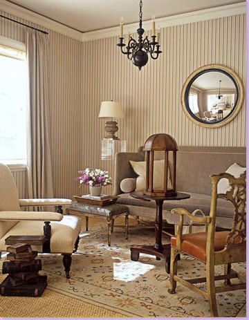
The study. Area rug placed over the seagrass. The mix of furniture styles in this room is unusual and exciting. Notice the wonderful striped wallpaper.
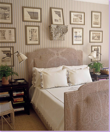
The guest room, adjacent to the study. Paisley covers the upholstered bed. Again, a collection of framed prints provides interest. Notice how Powers used a pedestal to break up the expanse of prints.
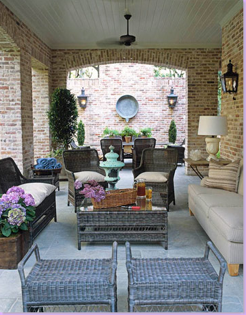
The covered loggia, an outdoor room next to the swimming pool. Very inviting.
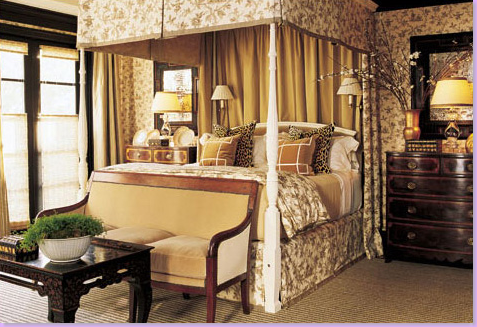
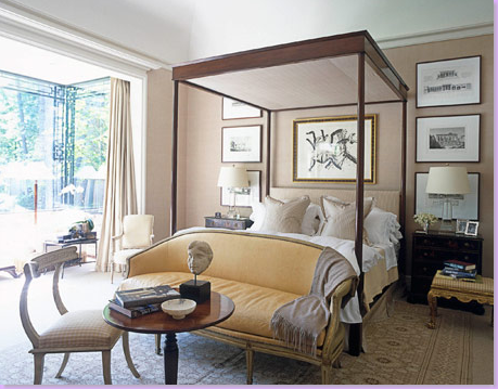
The master bedroom. I love how Powers placed the settee in front of the bed creating an intriguing vignette. Again, framed prints line the wall behind the four poster.
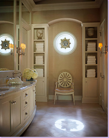
And finally - the master bathroom. The focal point of the room - the cabinetry. Only Powers could take what is usually a boring part of a bathroom - the linen closet - and make it a highlight. Flanking the bullseye window, two columns of shelves meet in an arch. The round shape of the window is repeated in the back of the chair's shape. The sunburst mirror in the window is genius!
I hope you have enjoyed seeing the diverse and prolific portfolio of J. Randall Powers. Young, with years ahead of him - the possibilities for the future are endless! Imagine another decade or two or three of work - how exciting to think about! Powers' has done Houston proud! Good luck Randy - we can't wait to see what you've got up your fashionable sleeves!
Post Title
→J. Randall Powers - Houston's Finest
Post URL
→https://porobligacin.blogspot.com/2008/10/j-randall-powers-houston-finest.html
Visit PoR oBliGaCióN for Daily Updated Wedding Dresses Collection
