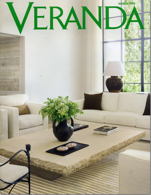
This month’s Veranda – it’s a good one!
I opened an email from a reader – she casually mentioned she wasn’t happy with the new Veranda, she found it boring and thought perhaps I would join her in the bashing. I thought, should I? Should I pretend I agreed with the reader even when I truly didn’t? After all she is quite nice and sweet enough to email me and the last thing I would want to do is offend her by arguing about a magazine, of all things! So, I pondered my answer to her (and I wonder why my emails are so stacked up!) before I chose a neutral position:
I wrote back:“haha. I kind of liked a few articles - the one from Houston especially!” - an understatement of the year, I would say. Kind of liked it? How about, well – more on that later!
As I said, it’s just a magazine after all – 150 pages of a few pretty pictures and lots of advertising in between. But, why did she dislike this Veranda so much, when I absolutely loved it? Who knows. I’m sure if the editors could bottle up the formula for what makes a magazine likable, they would. The fact is, I think it’s a great issue, full of beautiful homes and mouth watering jewelry and gorgeous flowers. What more could any woman want?
Reading it, I felt that editor Lisa Newsom had called me up and said, “Joni, what do you want to see in the March issue? Tell me!” And then, she delivered it. All.
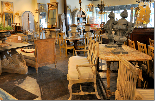
Tara Shaw’s Houston shop.
The issue is full of things a Houstonian would love, so maybe I am biased. Newsom starts with a small piece on Tara Shaw’s new antique reproduction line. She then shows a house in Colorado owned by a Houston businessman/socialite – it’s always a thrill to see how the other half lives! Then, there’s a wonderful apartment in Paris full of antiques – owned by an American designer. And whoa – Newsom even adds a house by Dan Carithers. How long has it been since any new work by this Atlanta designer has been seen? That alone is worth the price of the magazine.
But Newsom doesn’t stop there. The cover story is a house by the hottest married couple in interior design – they are so hot despite the fact that no one even knows their name, much less can pronounce it or spell it. The Belgian, Californian, Mediterranean Modern house all rolled into one is the work of Michael and Alexandra Misczynski. Remember those names. You are going to be hearing them a lot. Well, just remember the name of their business - Atelier AM - if you have trouble with their last name. Except how do you really pronounce Atelier? Why did they choose a difficult business name when their own last name is impossible???
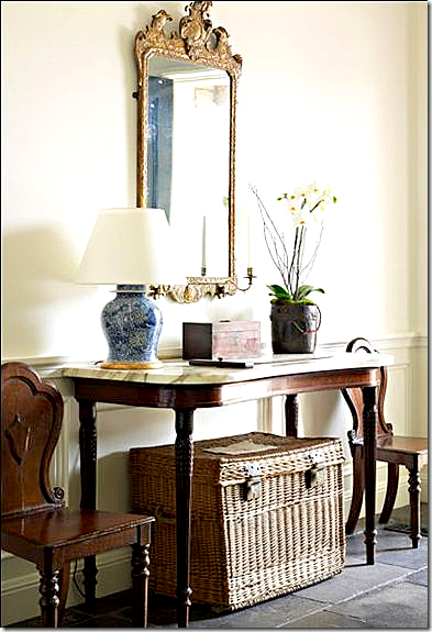
A casual entry hall by Atelier AM aka Michael and Alexandra Misczynski.
Everyone who can properly pronounce their name is talking about this couple. The Misczynskis started their own business in 2002, and half of Hollywood, who are probably the only people who can afford them, have hired them. The focal point of the house in this month’s Veranda is a huge wood cabinet bought in Belgium from Axel Vervoordt. I can only imagine how much that one piece cost, much less the rest of the furniture. It’s all casual and wonderfully Rough Luxe, but don’t let casual be confused with inexpensive. Everything here has a provenance.
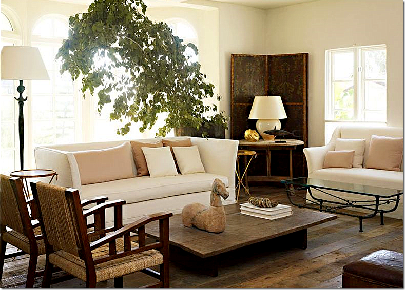
Living room by Atelier AM. I love this room – with the blush pink silk pillows mixed in with all the rough woods. Atelier AM is the personification of Rough Luxe. Beyond fabulous!!!
But, it wasn’t for Carithers or the French Apartment or Tara Shaw or the Misczywhoevers that had me driving by the grocery store at 12:00 midnight and stalking Barnes and Noble looking for the March Veranda, even though that felt so good! I hadn’t driven around looking for a new magazine issue in ages! It’s just too sad to do all obsessing now - the racks are so empty! There are so few decor magazines left to buy except for the Big Three, what I now call House Beautiful, Elle Decor, and Veranda and a few international issues. But, I digress. I had heard the blogosphere mumbling about this Veranda showing Kay O’Toole’s new house and that was what had my mouth watering like Edward’s whenever Bella is around. Honestly, I’ve been waiting over two years for this issue!

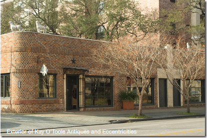
O’Toole owns a French antique shop housed in a 1920s brick building that was once home to several different businesses. Through the years, she eventually acquired the entire building and tore down the dividing walls – creating a long and narrow haven for the best of what France, and now Belgium, Sweden, and Italy have to offer. O’Toole has an uncanny eye to buy just exactly what you want – everything in her shop is delicious. It’s impossible to walk away without feeling wistful about what you have left behind for someone else to stake claim on. O’Toole’s eye extends of course to interior design. Not for other people, but for herself. Through the years her changing houses and decor have been published, allowing her devotees to follow her lead. The crowning touch was her apartment in a mid century high rise that half of Houston’s designers – interior and fashion – live in. Again, like at her shop, she combined one apartment with another, and another again – stretching her living space to accommodate her growing collection of French chairs, no doubt. The apartment was so far ahead of itself. Looking back at it now – she moved there over 15 years ago - it’s amazing to recognize the trends she indulged in before they were trendy. She had white vellum books when no else did, and crowns were everywhere before anyone collected them. There were painted pieces and dark woods mixed in with concrete garden elements, though hers were centuries old. There was a light gray antique Fortuny covering most of the chairs - cut from curtain panels she had uncovered. Houstonians who are into design went slightly batty over her place. I know I studied it – every inch and then some. At one point I even took out some tracing paper and tried to draw the floor plan in order to understand it better. It was, in a word, gorgeous. Simple, almost plain, yet elegant, a Parisian flat in the middle of the southwest. In the end, I think that apartment was publicized three times, once locally, once in Veranda, and once in a decor book. Each photo shoot was just a little different than the next to create excitement. The space was so perfect for Kay. She shared it with her partner, just the two of them, high in air, overlooking the greenest part of Houston. Why would anyone ever move?
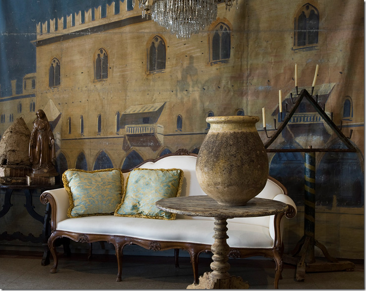
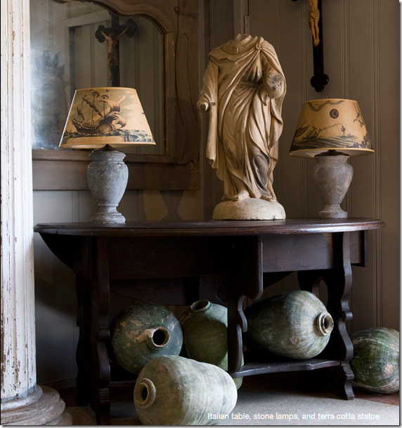
O’Toole’s shop, a mix of French, Swedish, Belgian and Italian antiques.
But O’Toole had other plans. She had long dreamt of living in a house modeled on a centuries old New Orleans design. She marches to her to her own silent beat, and she was now ready to create a symphony. Behind her shop, which fronts one of the longest and most traveled streets in Houston, there is a large back yard, filled with a gravel parking lot and ferns – thick and unruly. She decided to build her house, an enfilade, in the back of the yard. One long side would face the parking lot and the store’s back, the other side would face the back property’s fence. The house would be narrow and one room deep in most places. She would design it on scraps of napkins at dinner, tweaking it until it became her masterpiece. Finally, the enfilade became a reality, rising up from the ferns and gravel.
Kay’s antique shop, filled with European antiques.
One day Kay was sweet enough to take me out back to see the house, still under construction. She graciously smiled at my ooh’s and ah’s, and pointed out what would be where – her kitchen, the living room, her bedroom. She showed me the French doors that had just been installed. They were from a large cache of old metal windows she bought when a River Oaks mansion was being demolished and she had designed her enfilade around these glorious pieces of glass and steel. When it was all finished I once stopped by and hinted at maybe seeing it again, now completed and furnished. Oh no, it was a mess, not ready for its debut, a million excuses from someone who is a perfectionist at being a non perfectionist.
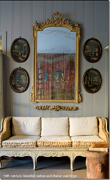
I adore these oval Italian paintings.
So, do you understand, now, when I say I’ve been waiting for a few years, to see inside Kay’s new house – her own personal piece of the French countryside, hidden away right off a busy street in Houston? I knew it would be published, but when? This month, Lisa Newsome – finally gives me the grand tour.
Kay’s shop: Kay O’Toole Antiques and Eccentricities. Her new house is located behind this 1920’s brick building, past the gravel parking lot and fern garden.
I would love to show and discuss the photoshoot of O’Toole’s new house here, but I can’t ruin it for any of you who haven’t yet seen it. Instead, let’s look back at her former place in the sky and remember how beautiful it all was back then!
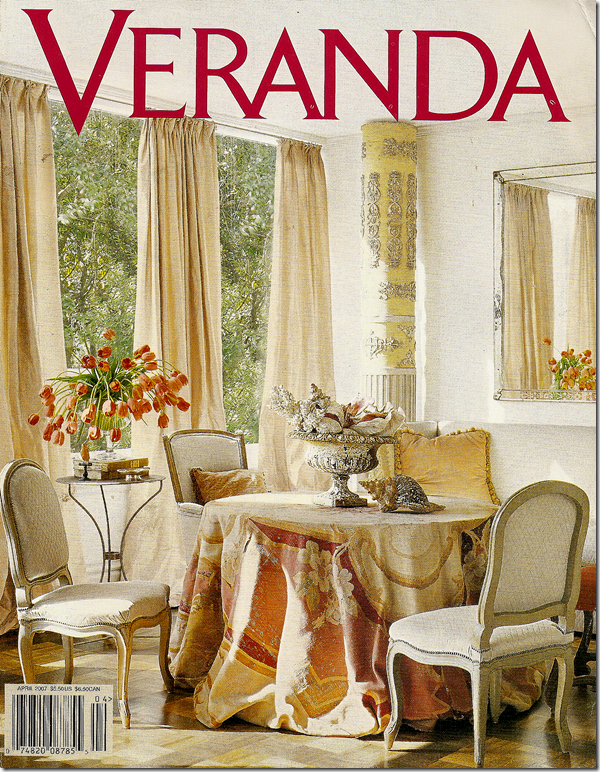
The March 2007 issue of Veranda shows Kay’s famous antique Aubusson rug, casually draped over a round table. Stunning. I’ve wanted to copy this look for years! One of Veranda’s prettiest covers. All photos by Tria Giovan for Veranda.
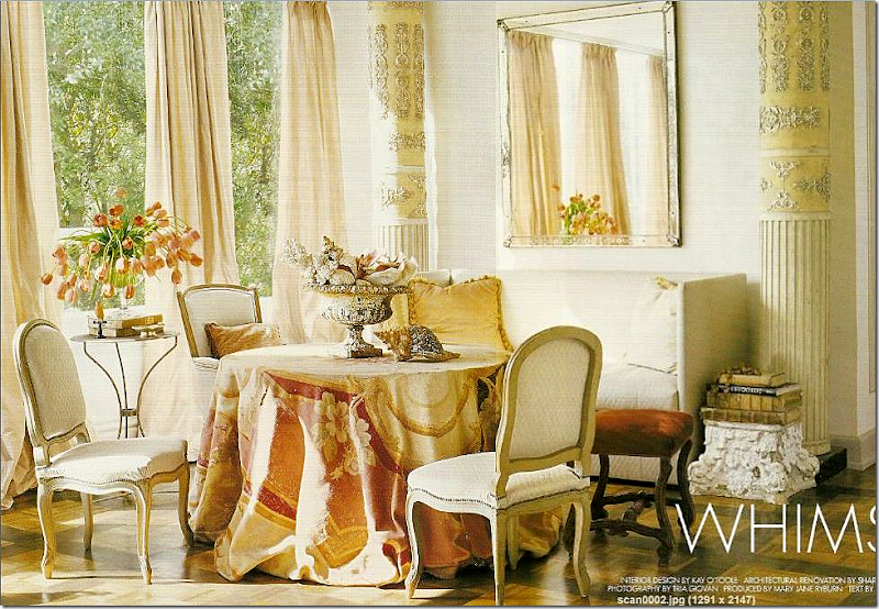
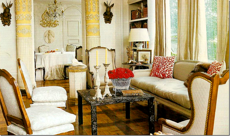 The main living area in the highrise – with the French settee surrounded by French chairs, some covered in the gray Fortuny and some in a quilted white linen. Ahead of the trend, two faux deer heads flank the doorway to the dining room. The walls were painted white back then, while most of us still had color on ours. Silk taffeta curtains hang simply from the top of the windows. The yellow papier mache columns played an integral role in the design of this apartment, but they are absent from the enfilade. Instead, they have now moved to the store, looking for a new home.
 Off the living room is the dining room with the gray and white Fortuny covered chairs. The fabric covers the table too. An antique screen shields a door. In the new house, the Fortuny is gone, replaced by a light lavender fabric that covers the chairs.
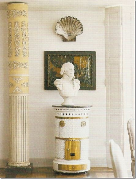 More trendy items from years ago: A Swedish stove stands next to one of the many papier mache columns placed about the space. A bust stands guard under a large clam shell. This army figure shows up again in the enfilade.
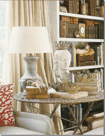
Next to the main living area is another sitting area – three apartments were merged into one. A concrete capital holds antique books, while a steel garden table holds tulips. On the skirted table, one of the prettiest I have ever seen, a crusty urn holds a collection of shells, again, years before shells became so important in today’s decor. The walls are stark white, while the taffeta curtains are a slight champagne color. Too gorgeous!!
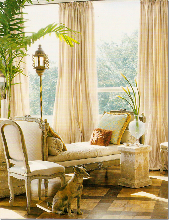 Across from the skirted table is a daybed with another garden element standing in for a table.
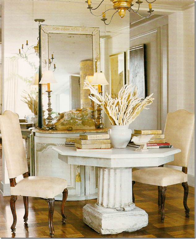
Reflected in a wall of antiqued mirror is more concrete, vellum books, and ironstone. Birds are another favorite of O’Toole’s. Notice the beautiful painted console. The parquet floors have been painted in a Versailles pattern. The mirror reflects the Italian light fixture that today is so wildly popular.
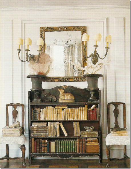 Two Fortuny covered chairs hold more antique vellum books. More urns, more shells, including sea fans. This might be the first time I ever saw sea fans used as a decorative object.
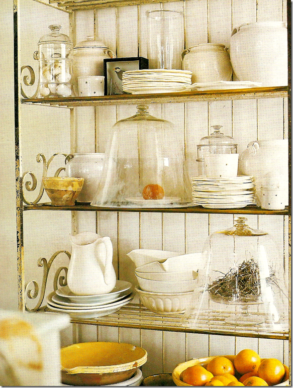
This is the only picture of the kitchen – which is actually two made into one. Here, a collection of iron stone and yellow ware, cloches and bird nests and eggs all rest on an antique baker’s rack.
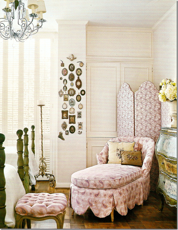
The guest room is a charming space – a Paisley slipcovered chaise with its large scalloped detail shares space with another screen and antique commode.
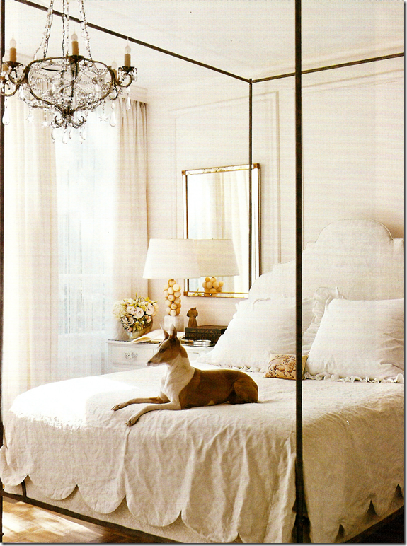
O’Toole’s bedroom features another large scalloped detailing. The simple room is all in white – all moldings were added by Kay. The new house, shown in this month’s Veranda is still all antiques, mostly monochromatic with touches of lilac. Above all, it is elegant – just as this space was and it is totally original, totally Kay O’Toole. Finally, it is interesting to compare the two spaces, seeing what pieces were reused and what was not. Her bed, for instance, is used in the new enfilade, exactly as seen here. See it all in the March 2010 Veranda.
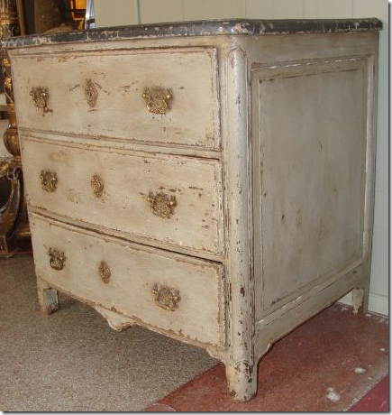
Kay O’Toole has a store on 1st Dibs. This painted French commode is a personal favorite. Beautiful!
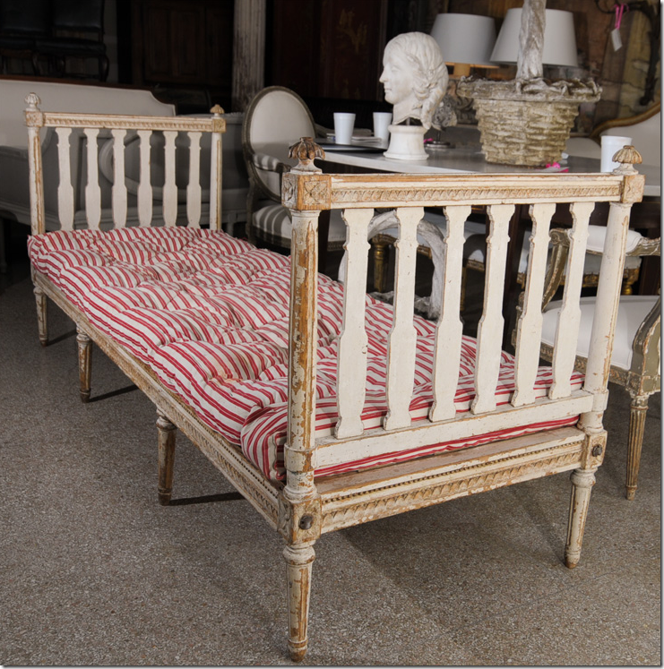
This Gustavian daybed is another favorite.
And I love the Venetian sofas on her 1st Dibs site! To see Kay O’Toole’s web site on 1st Dibs, go HERE.
It’s really raining Houston in magazines this month. Another great Houston house is in the beautiful “All About Blue” March issue from House Beautiful! The house is designed by a trio of Houstonians: Babs Watkins, Julie Watkins Baker, and Eleanor Cummings. Whew! What a bevy of talent. The house is absolutely gorgeous and another must see. Congratulations to all of you!!

A special shout-out to interior designer and blogger Tobi Fairley whose work graces the cover of this month’s House Beautiful, above! A huge congratulations to Tobi!! To read her blog and see her beautiful portfolio, go HERE.
Don’t forget Texans – this Sunday is the Urban Market. For directions and times, go HERE.
AND AND – one last thing – I promise! - Cote de Texas is going to be offering a fabulous giveaway next week. Be sure to check in for more information. You are going to LOVE this giveaway, I PROMISE you!!!
Post Title
→A Texas Enfilade
Post URL
→https://porobligacin.blogspot.com/2010/02/texas-enfilade.html
Visit PoR oBliGaCióN for Daily Updated Wedding Dresses Collection
